
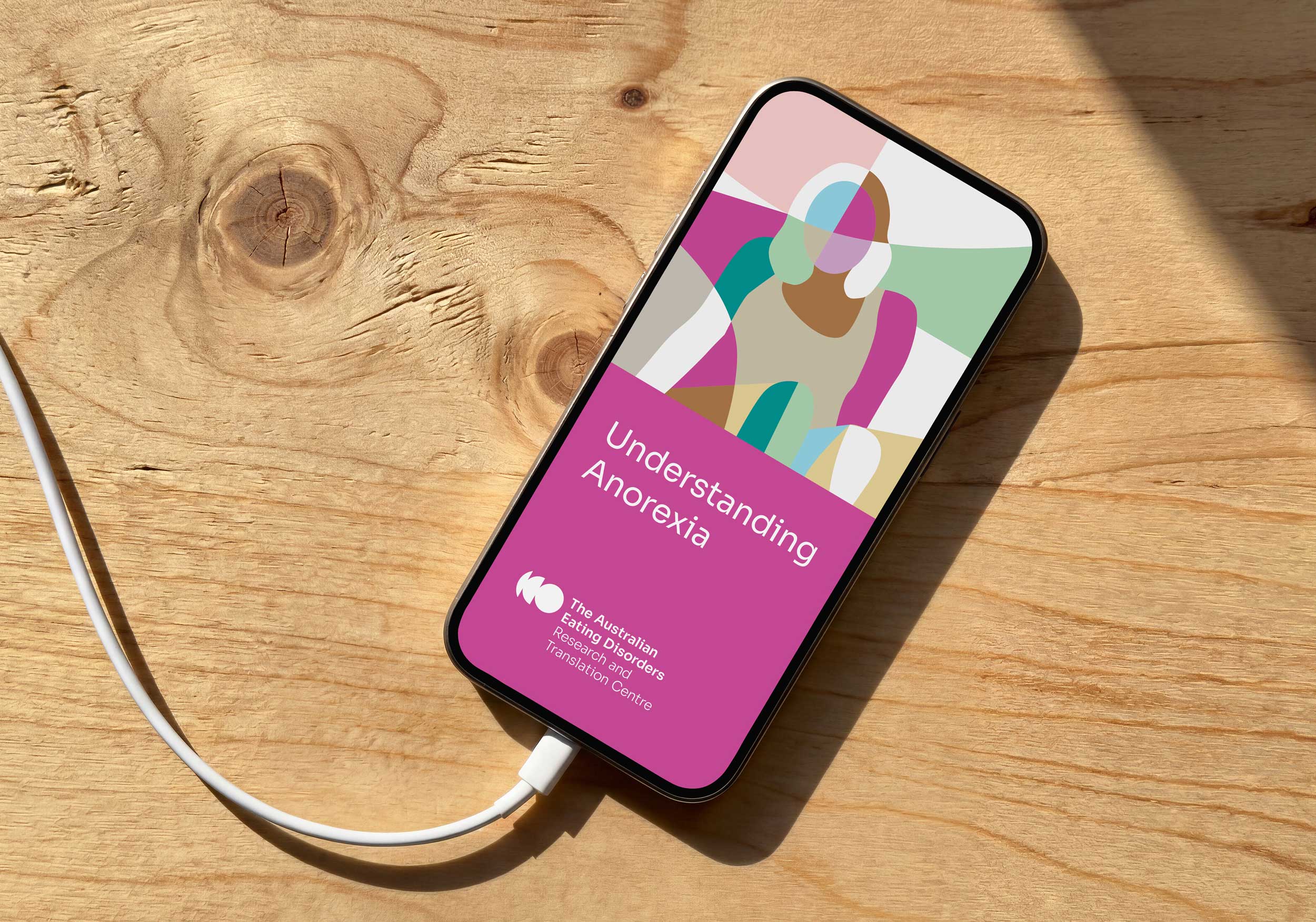
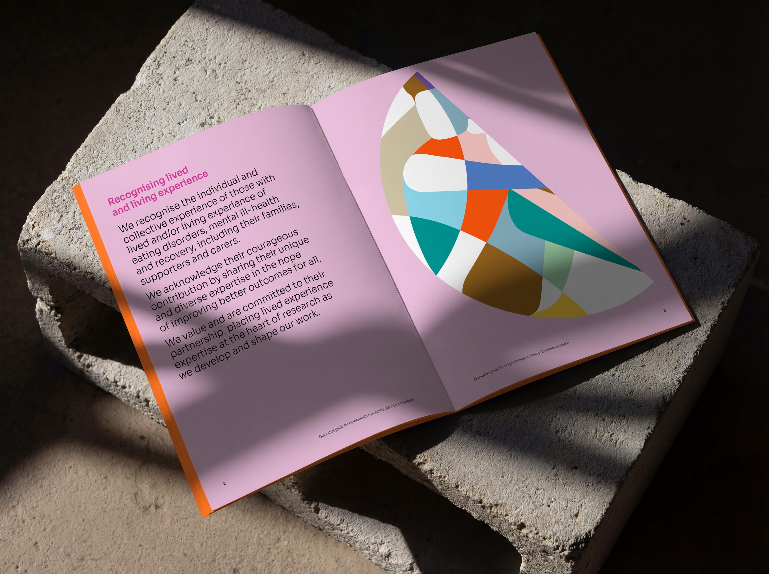
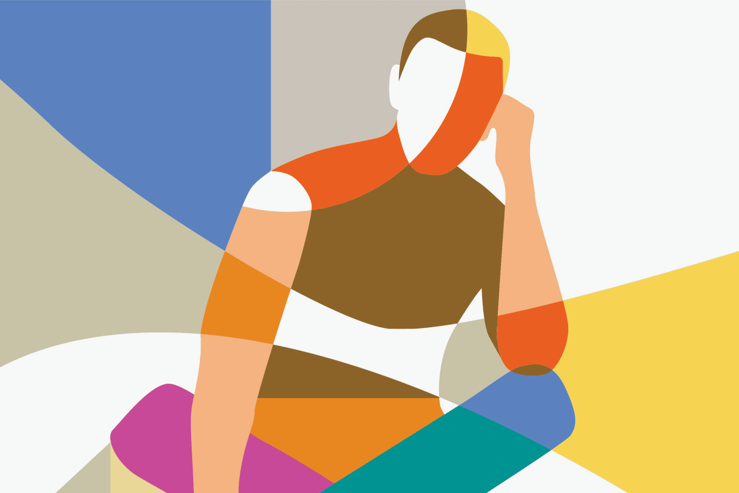
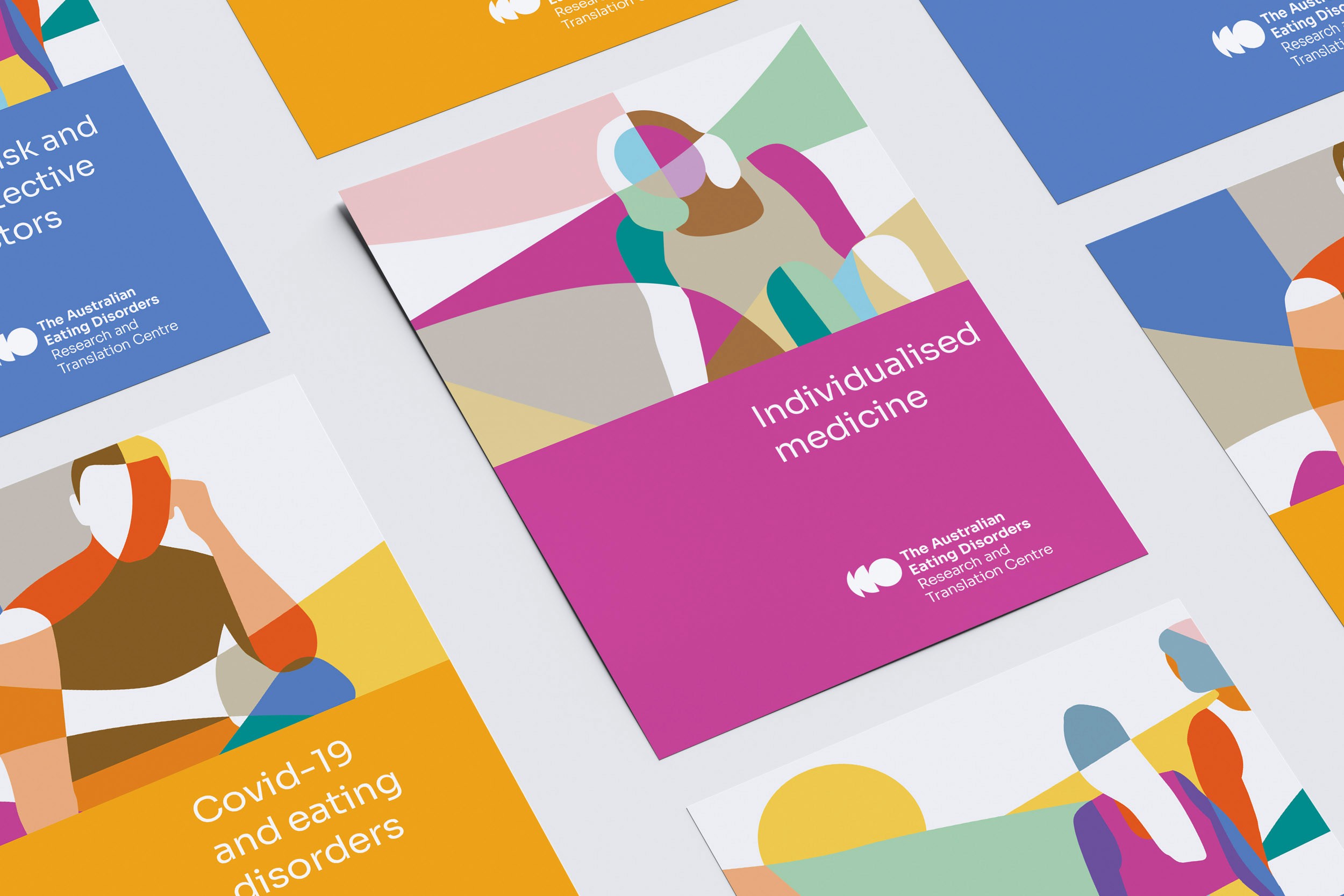
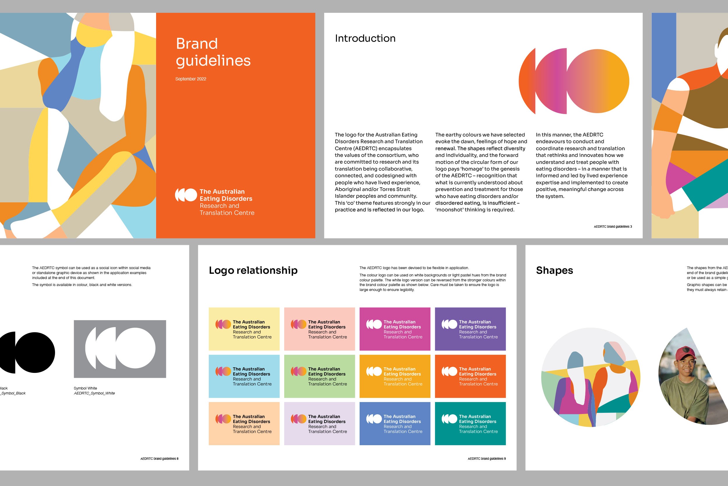
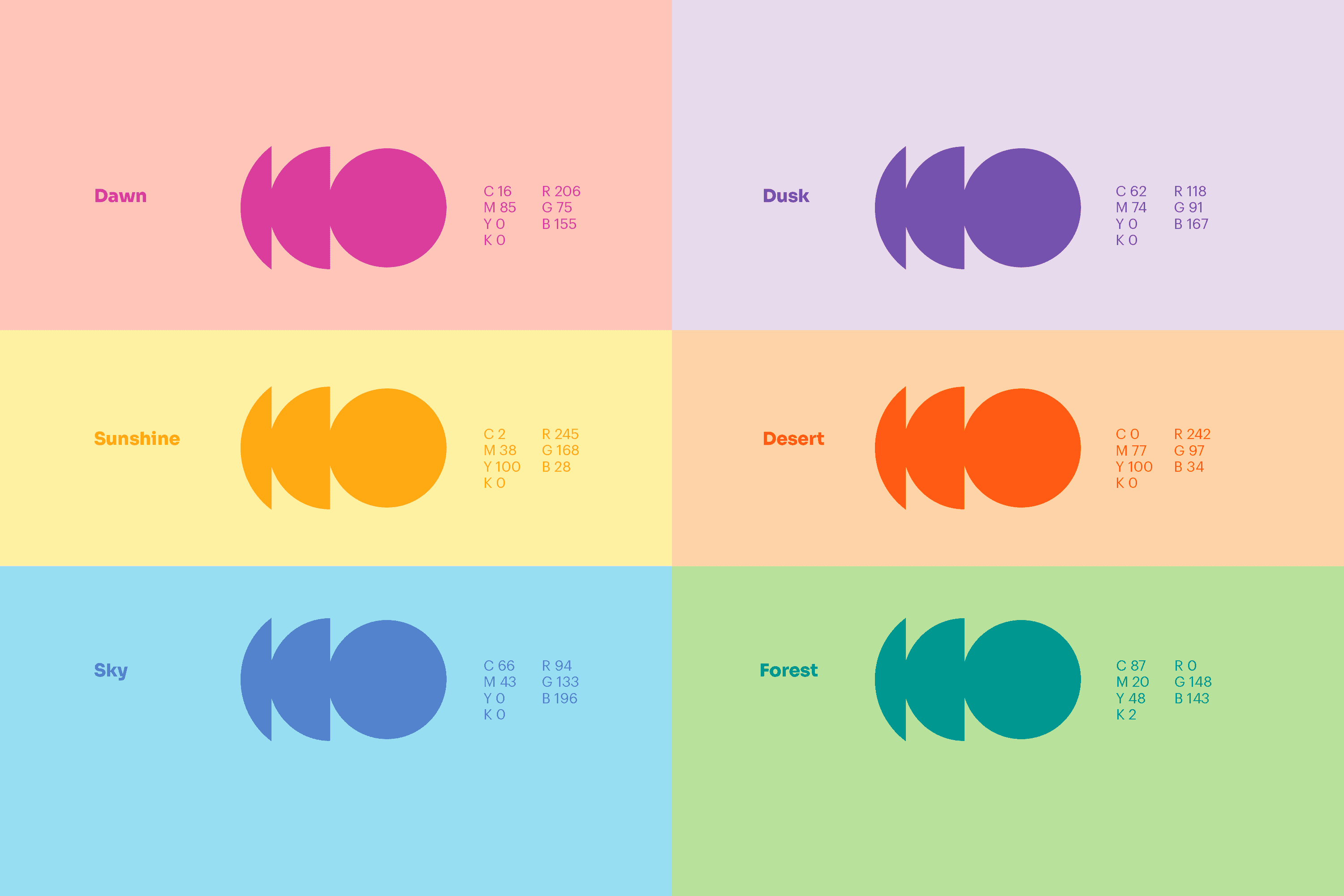
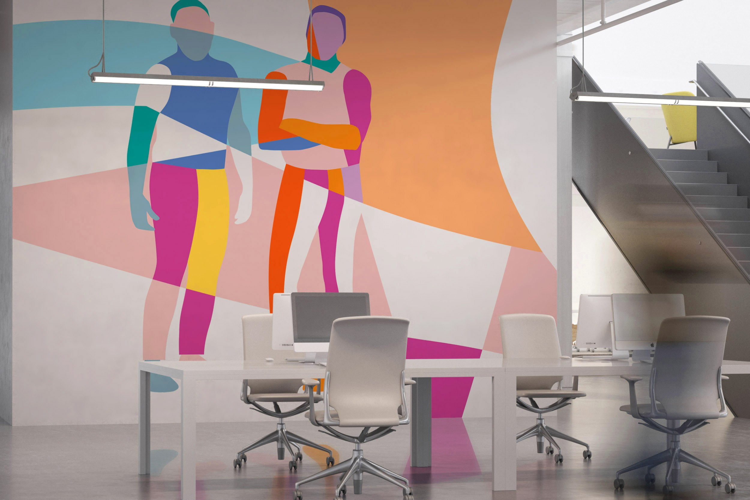
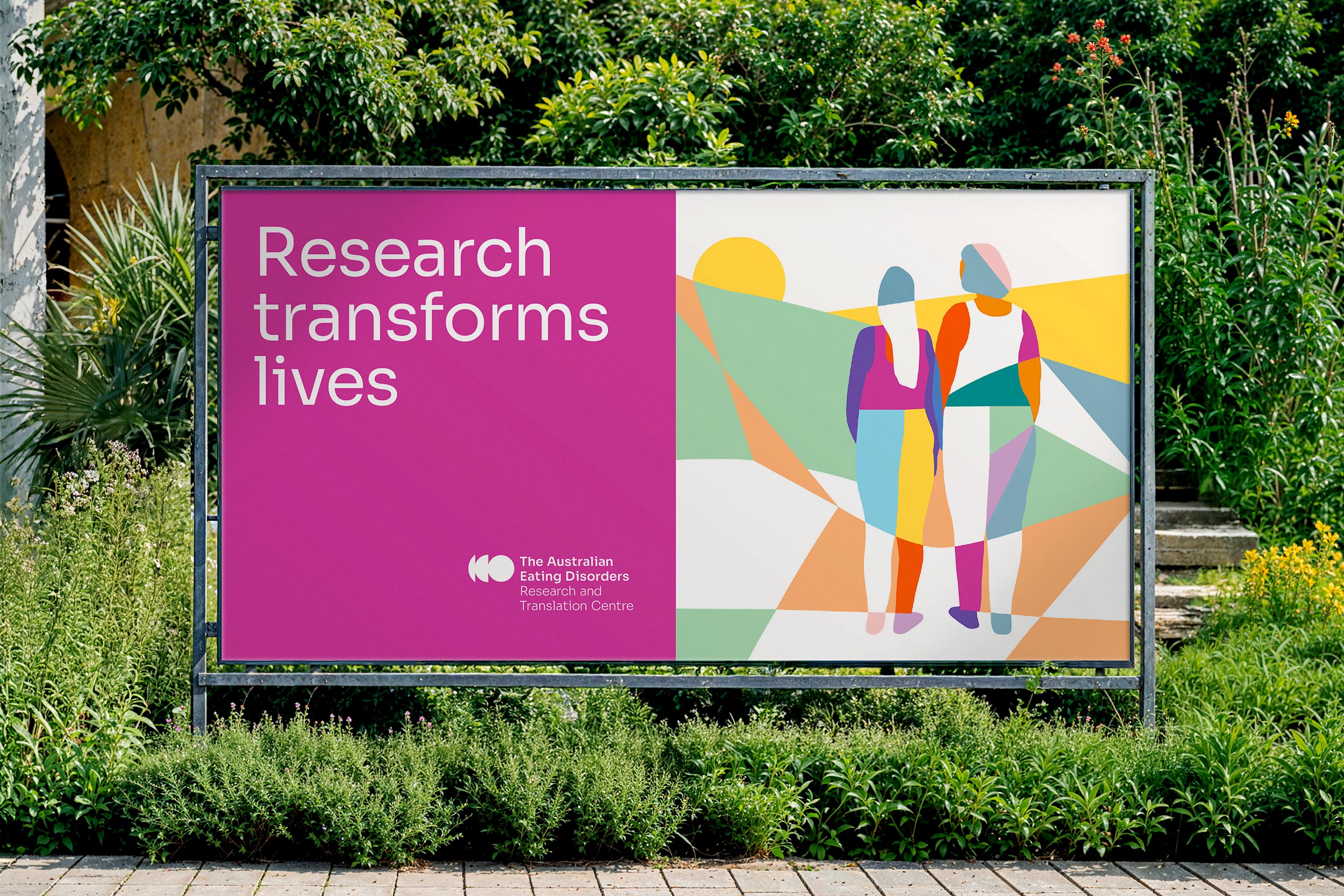
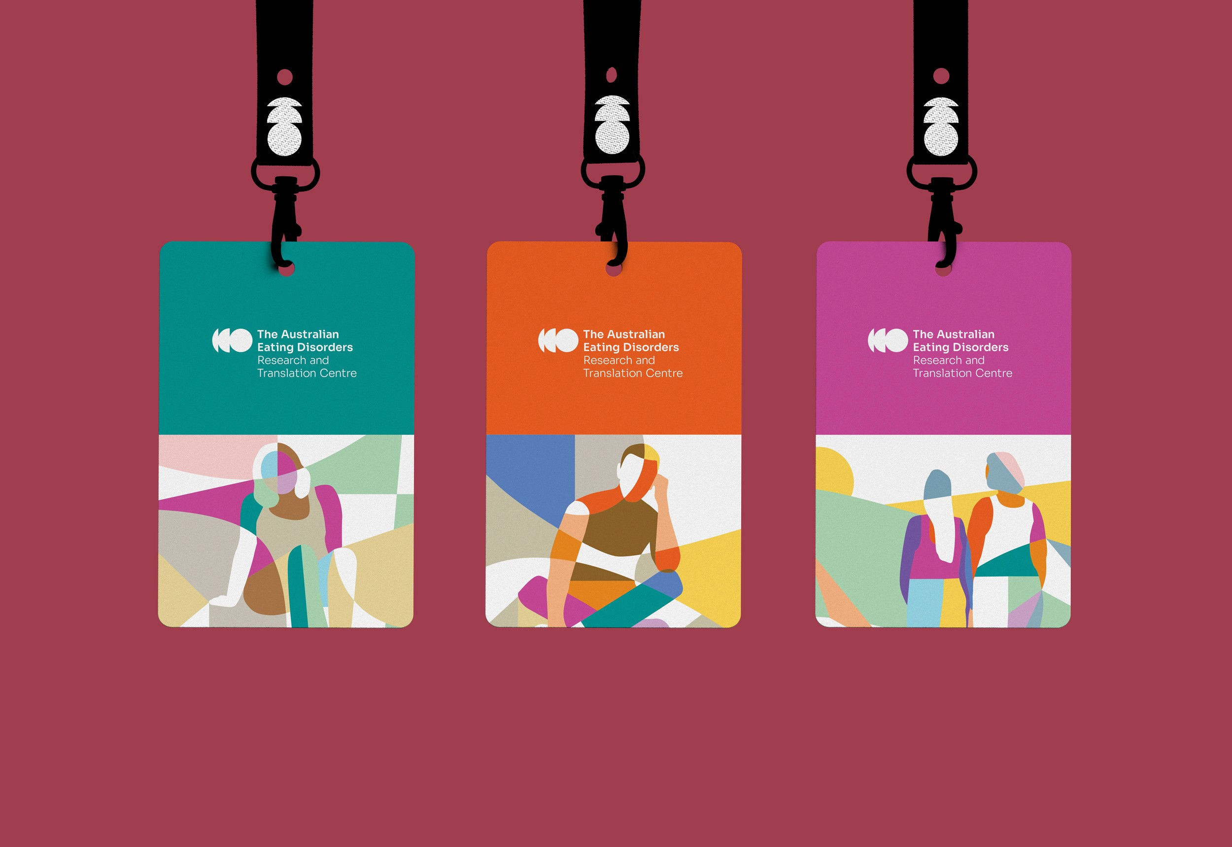
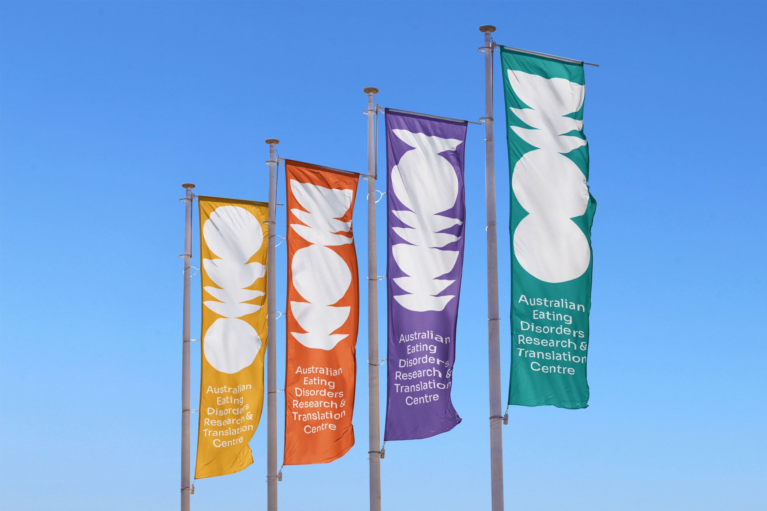
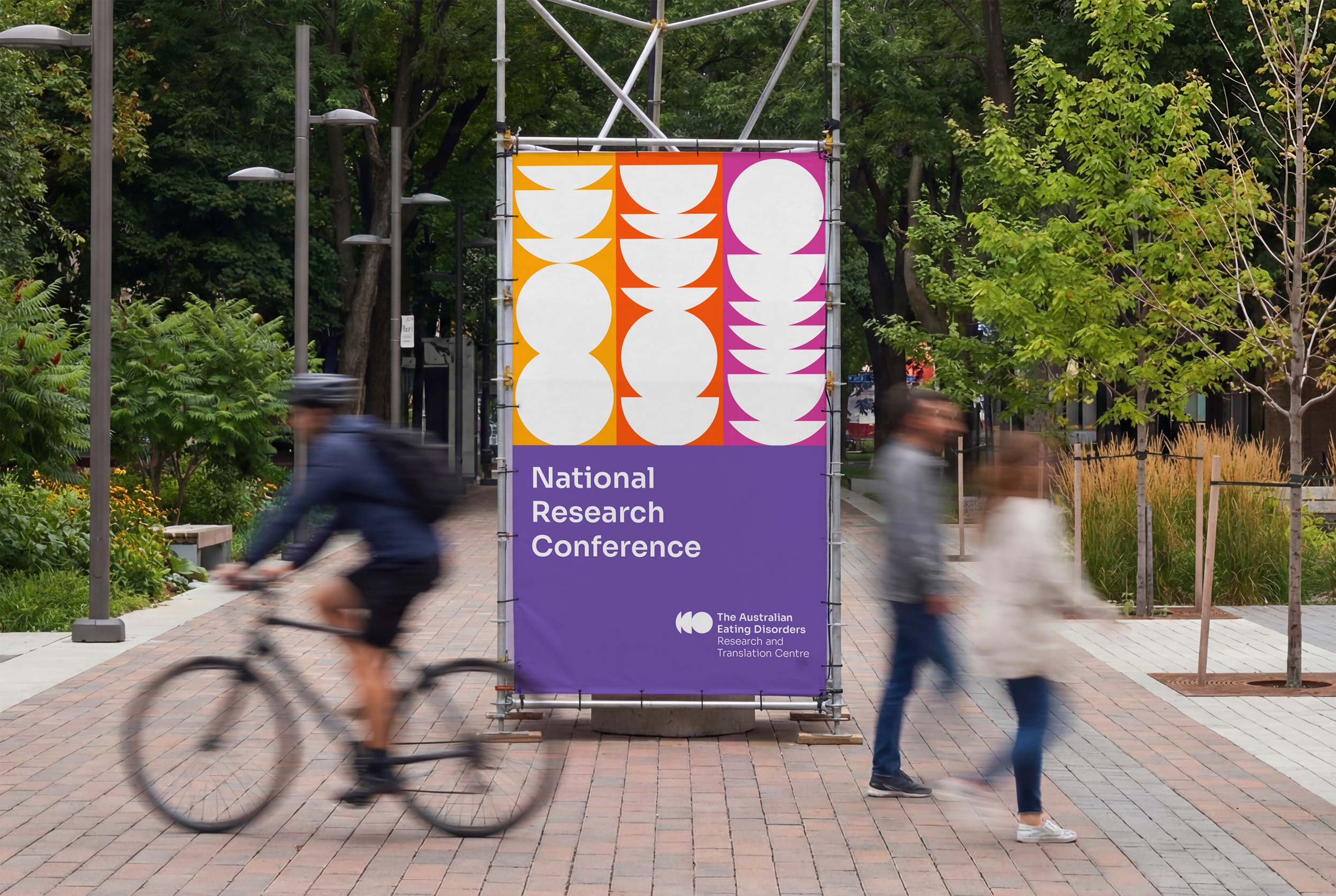
The brand identity is built around the values of collaboration, connection, and community — a warm, human-centred visual language anchored by organic portrait illustrations that celebrate inclusive body imagery and reflect the full diversity of those the organisation serves.
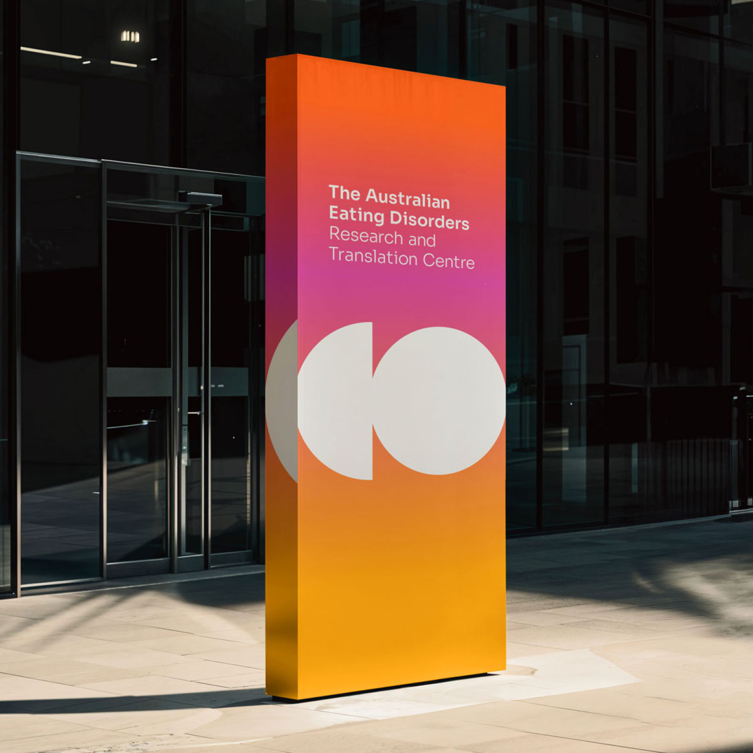
The brand tone is deliberately strong, loud, and confident. Bringing the conversation into the open, with the belief that visibility is the first step toward change.


Sonia, you and your team have done an incredible job!! Thank you! It’s been a pleasure working with you on the brand, and we have sincerely appreciated your consideration of our views and lived experience perspectives. I can’t wait for the words and logo to be shared with the Executive and then for the world to see!
— Australian Eating Disorders Research and Translation Centre


